When we looked at Toaplan’s Rally Bike arcade game here recently, I mentioned a list of ideas for stuff to write about, outside of my big core list of favourite games. It’s mostly other games to look at that I’ve never played but have some interest in discovering, as well as games I have played but never really gave much of a chance for whatever reason, and then some other stuff… My detailed plans for when I retire to Silent Hill or exploring the mystery of the secret guy in the green jacket in Resident Evil 4 are a couple of examples of that kind of thing, but the one that had been hanging around that list for way longer than anything else was a work in progress bunch of favourite loading screens!

That list covered all systems, although in reality it was mostly a mass of ZX Spectrum stuff with a smattering of Atari ST, a bit more than a smattering of Commodore 64 and a single representative for the BBC, no less! We’ll come back to those, but as it was mostly Spectrum I thought we’d focus there; trouble is, I wasn’t sure how to focus so there it sat! Inspiration eventually came from a 2021 Christmas present from the wife, Game Boy – The Box Art Collection by Bitmap Books, where each game box covered was accompanied by some screenshots, a generous paragraph on the game and its history, and then another on the box art itself. And as we’re talking another form of retro game art, I thought that something similar might work here, so we’ll have a quick look at each game and my history with it, then I’ll let my completely untrained, colourblind eye go wild on its loading screen! I’ve got ten so what I’ll probably also do is put them in favourite order once I’ve done that, because believe it or not I’ve not done that yet, so you’ll be getting one of my famous lists created right before your eyes too!

Before we start, let’s briefly celebrate the Spectrum loading process! I know that many of you will already be hearing the sound of data being pumped into the machine from a cassette, or visualising the strobing borders, whose thickness signified the bit rate of data being received, and colours denoted its state, where red and cyan meant waiting for a header condition, and yellow and blue meant it was receiving a header or data. At least until some clever clogs came up with fancy custom loading routines. Technicalities aside though, one of the great underrated thrills of buying a Spectrum game was the very first time you saw that loading screen emerge, line by line. If you were lucky you’d seen gameplay screenshots, but they rarely gave way for the loading screen, so this was all new. And if you weren’t so lucky, this was your tantalising first look at what you’d just spent all of your money on! Sometimes they were underwhelming or even virtually non-existent, but in the main you could expect some kind of representation of the game’s cover artwork, or maybe a larger than life interpretation of its gameplay, or even something totally unrelated or downright bizarre! Let’s not forget the flip side of that thrill though – the anxiety when you had a hit or miss game that might load but might not, and you’d be praying for that loading screen to turn into a title screen after its regular two or three minute duration, and not a return to the dreaded Spectrum boot screen! I do remember that being the case for Shao-Lin’s Road, and when that’s your favourite game at the time that’s not a good place to be! Let’s not dwell on dark business like that here though – we’re here to celebrate the loading screen, not fear it, so let’s get on with it…
10. Wizball.
The thing that excited me the most about this particular list of favourites was that most of the games themselves weren’t favourites at all, and as such I’m not really likely to cover them elsewhere here! And right off the bat, I’m going to commit an absolute act of heresy by saying I never particularly liked 1987’s Wizball, and then immediately follow it up with another by saying I did, however, prefer my friend’s Commodore 64 version, though mainly for the soaring title and game over music, and definitely not for its comparatively lacklustre loading screen! I’d honestly have never bought the Spectrum version standalone, but it did come on Ocean’s Magnificent Seven compilation when I eventually bought that, mainly for Cobra and Frankie Goes to Hollywood over any of the other six games included. The thing with Wizball is that you need to give it time… around 35 years it turns out! It’s fiendishly hard to control, you see, but once you get it, you have a ludicrously original take on the side-scrolling shooter involving restoring colour to an incredibly polished and often stunning Wizworld by shooting stuff.
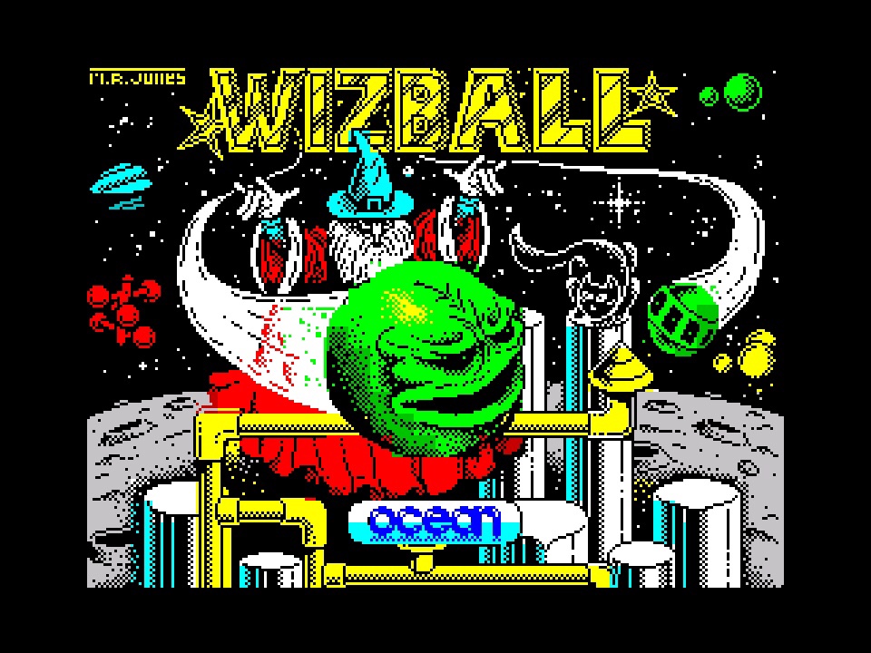
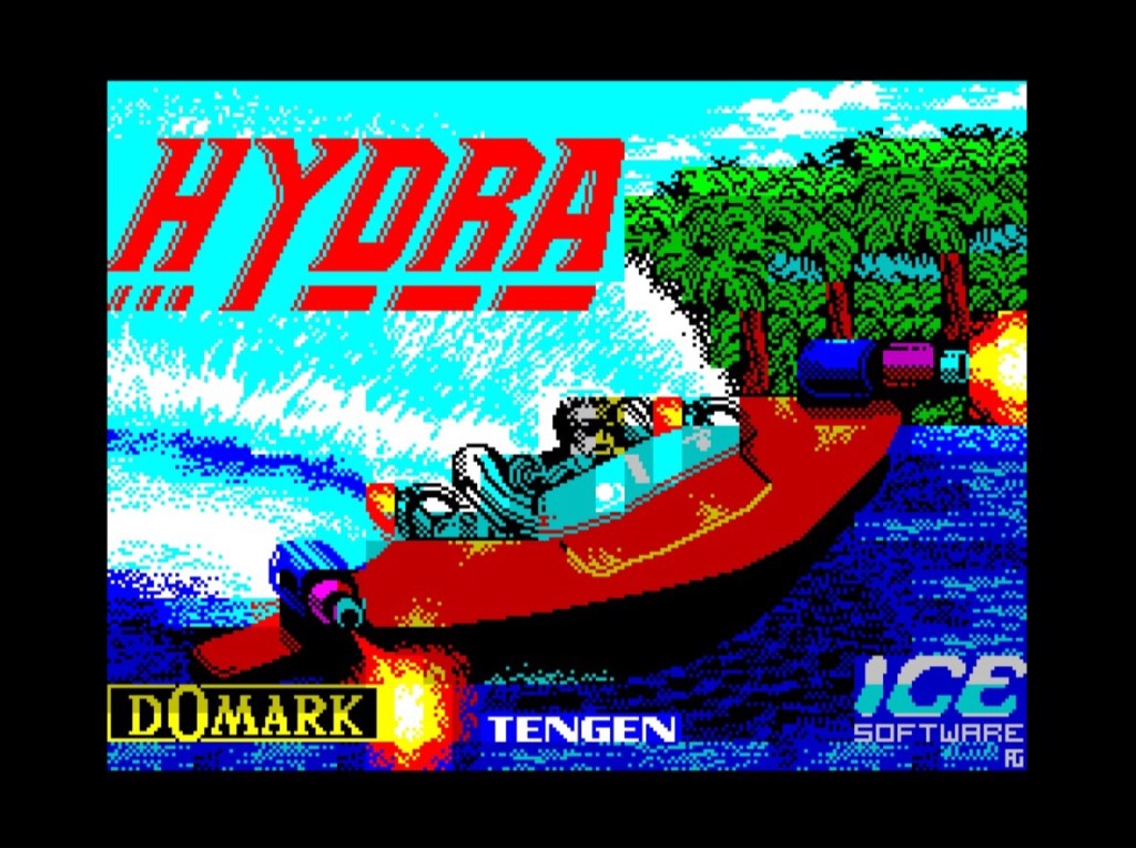
Mark R. Jones’ Spectrum loading screen replicates the cover art and magazine adverts of the time, although those never stood a chance because they were competing with Barbarian – possibly the greatest gaming advert ever, except maybe for its sequel because that includes a dragon as well as the original’s Wolf from Gladiators and Page Three starlet Maria Whittaker wearing a couple of metal discs! One of these days we’ll get to my favourite gaming adverts list too, but in the meantime, what’s most impressive about this loading screen is that it doesn’t just replicate the covert art, but thanks to the Spectrum’s legendary colour palette it takes it to a whole new level! You’ve got the classic Gandalf-type wizard in the background with a great beard, great hands and a cool hat that distinguishes him from Father Christmas, and he’s casting the bright green on green with yellow highlights Wizball into the foreground, and it’s just so much more dynamic than the advert! Elsewhere there’s a wonderfully cratered planet’s surface, decorated by the platforms and pipes and the like that are going to become so familiar as you play, as well as a great selection of its baddies against a shimmering star-field. And there’s your cat, Catelite, who’s going to be grabbing that colour for you, perched on a platform and ready for action as chaos surrounds him. And while the game might not be a favourite, what a great way to start this countdown with this striking work of art!
9. Army Moves.

Whilst my preference for Wizball’s loading screen over its gameplay might be a little controversial, I doubt that many would die on a hill for Army Moves! You’ll die a lot playing it though, and mainly within seconds of firing it up and starting its ridiculously hard Moon Buggy first stage, which has you awkwardly jumping over holes on a bridge and shooting at rampant enemy jeeps and helicopters coming the other way. Somehow beat that and you’re in a helicopter, side-scrolling right to left shooting stuff for what seems like an eternity before doing it again in the next stage, and the next… You’ll never see it, but the last bit’s a run and gun like Green Beret with more colour clash, that strangely reminds me of Everyone’s a Wally. And I know which I’d rather be playing!
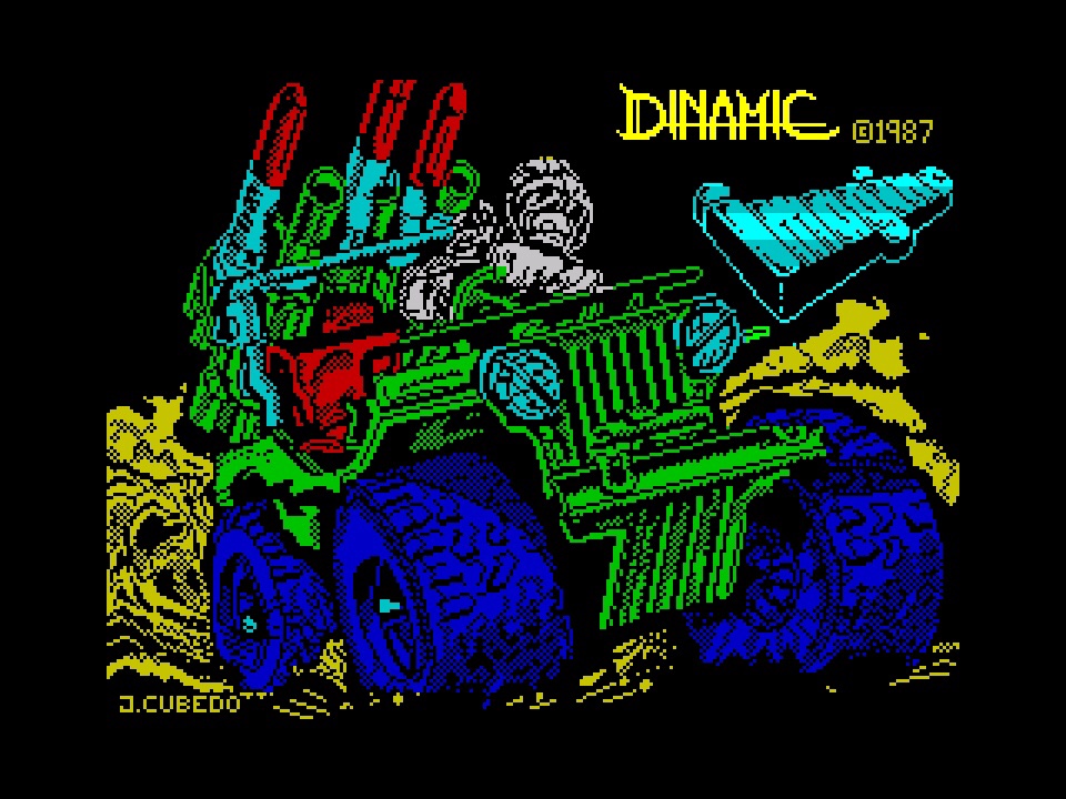
When I was a kid I used to love colouring books, and I think that’s why I love Army Moves’ loading screen – it looks like someone at Dinamic was told to get their felt tips out and go wild! The jeep from that horrific first stage dominates proceedings, and that makes sense because it’s the only thing in the game that most people will ever relate to, but they’ve done a great job at hyping it up! It’s massive, and its massive blue tyres give it a monster truck vibe – all the rage back in 1987 (but less so when I got it free on Your Sinclair magazine a couple of years later). The rest is a crazy detailed and beautifully shaded behemoth, all bright green and yellow and a load of red-tipped missiles, though I do wonder if the felt tips had run out by the time they got to the rather indistinct but somehow very masculine driver, who’s been left all white and not very well camouflaged at all! I guess when your gigantic tyres are that blue it doesn’t make a lot of difference though!
8. Batman: The Caped Crusader.
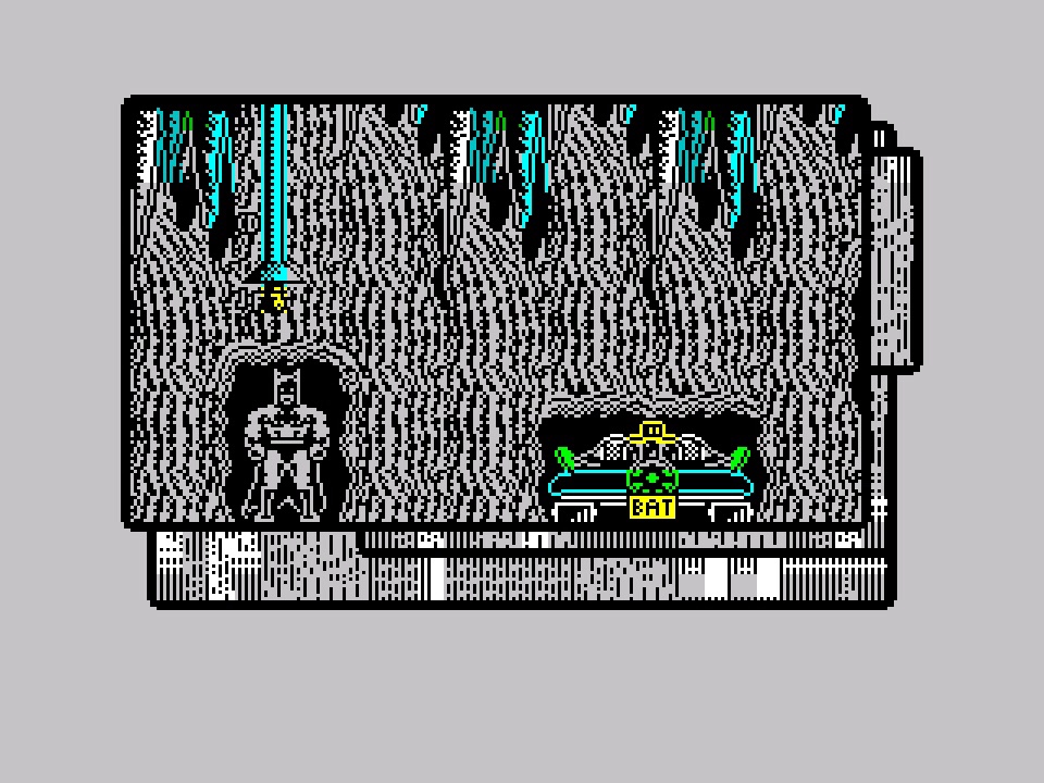
We’ve found a good ‘un at last! Well, the bits the aren’t black on red when you’re black on red colourblind, but since when has anyone cared about that? And I’ve always got the Atari ST version to fall back on. Anyway, we all went Batman crazy in 1989, an no one more so than those movie licence megalomaniacs at Ocean Software, though this one’s more comic strip in style than The Movie, and all the better for it. While that third Ocean Batman, which followed shortly after, is more memorable for being tied in to the film (and some really cool 3D driving sequences), this one is a more thoughtful action adventure, uniquely presented as evolving comic book panels – much like Sega’s Comix Zone did later. It was also unique in that it contained two adventures, one up against Penguin and the other against Joker, depending on which side of the tape you loaded. There is combat, but this one is more about exploration and puzzle solving, and as a result it properly nails the feel of Batman – as does that great-looking Batcave!
What a glorious, stuffed to the gills mess this particular loading screen is! I don’t know much about Batman lore, but I am seeing a Joker and Penguin more in the original TV series mould than any of the later movies, though I guess there’s some comic period that they properly fit in with, together with Batman. We’ll let the nerds worry about that though, and instead concern ourselves with the visual feast where there’s not an inch left to chance! While Batman dominating The Penguin dominated this overpowering vista, they in turn are dominated by The Joker, framed by a relatively subdued repeating playing card, from which his manic comic-strip laughter is literally bursting out and consuming every available space. That laughter surprisingly manages to dominate the colour palette too, leaving a big yellow smear burnt into your brain while the rest is filled with more sophisticated black and white and partially coloured shading. It all results in a very striking image that fits both the scene it’s portraying and the game itself quite perfectly.
7. Rambo: First Blood Part II.
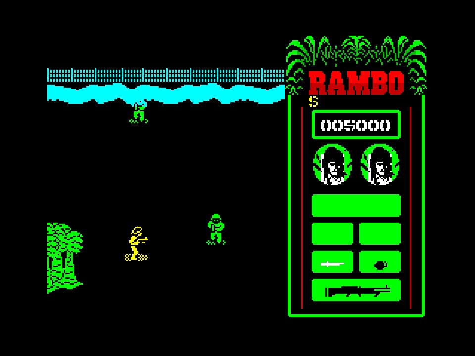
Now we’re talking a proper movie license! And, not for the last time, we’re looking at a game that had an advert that is also going to make an appearance in that particular favourites list when we get to it, and one that I even had on my bedroom wall aged 13 when it came out in 1985. Unfortunately we’re also back to nice loading screen, shame about the game again! It’s equal parts boring and frustrating, capped off by an unnecessarily long piece of Spectrum chip-tune every time you die that you just have to sit out before any sniff of action. Not that there’s a huge amount of that either, with your not-very-Rambo Rambo wandering about mostly black screens populated by the occasional green tree or white rock or red blob, and annoying enemy soldiers that like nothing better than moving in for the kill from an adjacent screen faster than it can chug along, so time for that music again! To its credit, things do pick up in the prison camp where you’re trying to rescue your PoW friends, and you’ll briefly stop pining for its similar but far superior very close contemporary Commando, but I mean “briefly” because you can finish Rambo in less than five minutes once you know which direction to point! Not that Commando’s first loop takes much longer, but just play that instead!
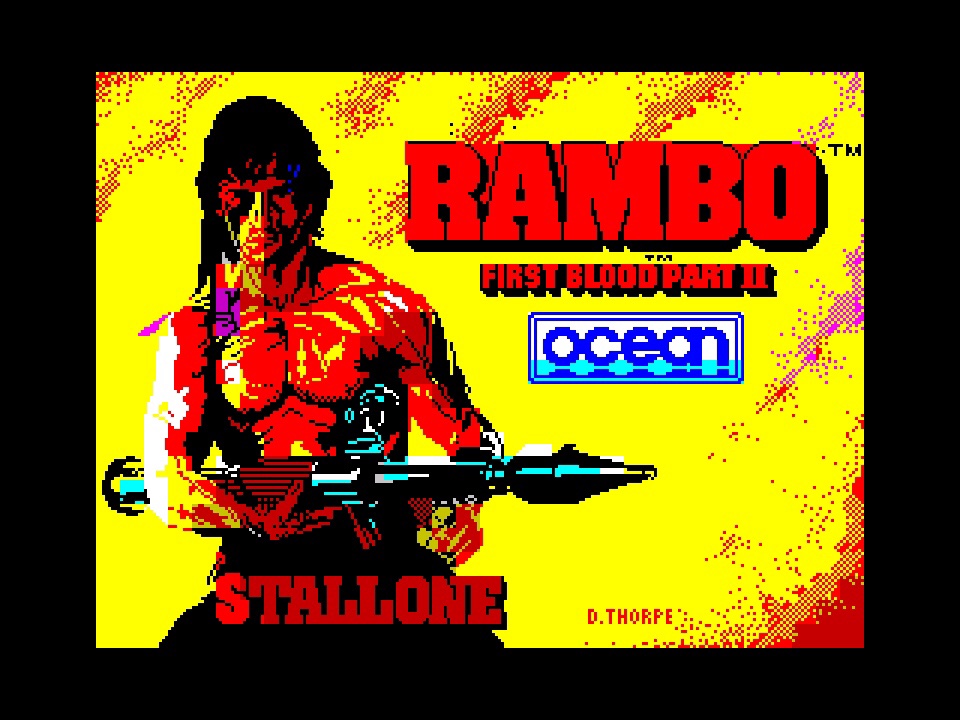
You couldn’t ask for more of David Thorpe’s loading screen, which replicates that advert from my bedroom wall, which in turn replicates the movie poster. It’s full of bare-chested Spectrum Stallone, with his rocket launcher and fancy magenta headband, and, just in case you’re not sure, “STALLONE” emblazoned in Rambo-red across his spread-eagled combat slacks. You will be sure though, because it’s unmistakably Stallone, to the point that if you look side-by-side with the movie poster, the highlights on his Hollywood skin are all intact, and completely distinct from his excessive muscle tone… If only the Spectrum could do orange! Stallone’s not my top highlight here though – that would be his fiery backdrop! The movie poster has him set against a wall of flames, but with all that red and yellow (and magenta) already used on making him look good, the artist had to get creative, and I think it’s brilliant! Mostly yellow, with alternating red pixels (and another hint of magenta) just doing enough across most of the background to spark explosive flames in your imagination, and only becoming solid in one corner, which acts to ground the overall minimal but also blockbuster vista. If only the game had this level of drama!
6. Vampire Vengeance.

Remember this one? You will if you’ve played it because it only arrived in 2020, and if you haven’t then you’re missing out on a remarkable advert for the vibrant Spectrum homebrew scene that, after all these years, still never fails to surprise, every single year! It might be relatively new, but it knows its heritage, and this is classic Spectrum platforming at its finest! You are Count Orlack, not a million miles removed from another Spectrum vampire, or vampyre, from Nosferatu the Vampyre. You’ve got to make your way through the thirty levels over four locales to get back to your castle, transforming out of bat-form then sneaking up and sucking the blood out of everyone you encounter so you can move on to the next. As much fun as flying about then going all vampire is, I’ve got to jump straight to the main character sprite, an impossibly well-realised cartoon interpretation of Max Schreck’s iconic Count Orlok from the 1922 Dracula rip-off, Nosferatu: A Symphony of Horror! It’s perfect, and the blood-sucking animation is literally to die for!

Juan Antonio Fernandez somehow manages to suck every drop of colour out of the Spectrum with this thing, and a bit more besides! The vampire is a kind of best of Dracula, based on the Nosferatu style of the game’s character sprite, but with a bit of Bela Lugosi flamboyance and some Gary Oldman monstrosity. Such violence too, with those great-looking claws tearing at the face of a similarly flamboyant Castlevania-styled would-be hero. And behind the wanton vampiric destruction, the background evolves that Rambo style we saw earlier, adding magic and colour to its burning sky, with a hint of further destruction and a village that’s been laid waste to earlier in the rampage. The colour here is just so well thought out and so passionately executed, and it could only have come from a Spectrum, whenever it was created!
5. Firelord
I’ve always considered Firelord to be one of the best-looking games on the Spectrum. The attention to detail, the clever use of colour, the medieval atmosphere, the diversity, the character in the sprites, the animation… It was love at first sight, and another advert from that other list I’ve got in mind did it no harm either, so when I got my Spectrum +2 around the time it came out in 1986, it was right near the top of my wish list. The trouble is that it plays like Sabre Wulf, and here’s another piece of heresy for you… I don’t really like Sabre Wulf! Firelord was money well spent all the same, and I’ll still often play it when I fire up the +2 even if I still don’t really know what I’m doing or where I’m going (and in this case, my regular advice about reading the instructions doesn’t make much difference)! It’s enormous maze-like village and haunted woodlands are just a beautiful place to get lost in, even despite the bad guys and the constant accusations of being a thief!

Steve Weston’s game artwork is a fantasy classic, with its exotic knight waving his sword about while a dragon surveys the burning village behind him, its terrifying aftermath bathing the night sky and everything else in an unnaturally deep red. The loading screen abandons the stricken village, as well as the dragon, and focusses on the knight, together with some very cool (but not very medieval) typography and a fantastic red spray filling in the blanks! For all the time I’ve spent not playing Firelord properly, I’ve never seen a dragon, and while there’s one referenced in its obscure narrative, I guess that’s maybe why it’s missing in action here! And less is definitely more as a result, with the knight literally given a chance to shine, his lifelike and delicately detailed armour now taking on a brilliant gold, with his red robes draped realistically over the top, topped off by his fancy helmet that says anything but Dark Ages! In complete contrast to Vampire Vengeance that we just looked at, this one might only use a handful of colours, but like the game it’s welcoming in, it uses them brilliantly, and as much as I like the more expansive original cover and advert artwork, this trumps them.
4. Athena

I’ve a feeling that my advert countdown is going to be a bit predictable by the time I get to it because here’s another one! And I’m going to maintain that it’s nothing to do with the scantily-clad and very athletic female protagonist, who in turn is almost nothing to do with the character you actually play as, but actually an appreciation of the arcade game behind this 1987 conversion! Okay, it’s all about her, but I am genuinely a fan too! It looks like Wonder Boy, plays like Ghosts ‘n Goblins, and the Spectrum port is a really good one despite the lack of colour, although I’m convinced it’s way harder than the original! There’s six worlds to power your way up through as you seek vengeance on some evil overlord for doing you wrong, with all kinds of weapons and armour hidden away Boulderdash-style to help you out against his minions, and once you’ve got over the difficulty you’ll have a blast never seeing most of it!

Okay, there’s no denying the loading screen, as well as the original cover art that it’s derived from, is nothing more than a perve-fest, but it stands to reason when the reality is that most of its mid-eighties audience is going to get laughed at for wasting their pocket money on being a cute princess once the loading’s done! Perving at this perfect pixel-perfect physique aside, it’s such a great piece of Spectrum artwork! Every element pops from its solid black base, boldly coloured for impact over reality, and they brilliantly combine to very accurately convey the predicament you’re about to get yourself into! There’s so much detail everywhere that isn’t black, with cartoon realism in muscle tone and dense foliage and the like side-by-side with more in-your-face playground fantasy on stuff like the razor-toothed tree! Apart from looking nothing like what you get in the game, it does an amazing job in representing it, all things considered!
3. Dan Dare: Pilot of the Future.

This is the only one of these games that I’ve ever covered elsewhere here before; in fact, like Ghosts ‘n Goblins that I mentioned a moment ago, it was one of the first games I wrote about, and while things might have evolved, I do enjoy seeing how they have, even if I’ll definitely go back and look at stuff like this again sometime! Dan Dare was my favourite comic strip, and seeing it brought to life in this fashion back in 1986 was simply staggering, not least for all of that colour with barely a hint of clash coming out of the Spectrum – it was like they were made for each other! If Firelord is one of the best-looking games on the system, I’d say that this is up there with The Trap Door and Exolon as just about the best, but it’s also got a lot more than just graphics! It’s a fantastic action-platformer in its own right, with our hero out to foil The Mekon’s dastardly plans once again in timeless sci-fi style.

The polish on display in Dan Dare’s loading screen is jaw-dropping. The characterisation is simply perfect, and I’ve never seen a better-looking Mekon – did you ever see a plain white t-shirt worn with such galactic menace? Thinking about it, did you ever see an arch-villain wearing a plain white t-shirt? Doesn’t matter what you’ve seen because it’s beautiful regardless! Beyond the comic’s famous title bar, Dan Dare is playing it a bit more formal, all military on black. with a look in the stars and some great shadowing to match. But The Mekon! The blue-panelled tech behind him contrasts wonderfully with his massive green head, plastered with an expression of sheer disdain as his mugshot is apparently taken, with all kinds of detail drawn out by the lighting that goes above and beyond the more subtle styling of his nemesis! This really is as good as either of them have ever looked though, whatever the media or platform, and I’m definitely including this game’s lesser two sequels there too!
2. Street Hawk.

I’ve just noticed that about half of this list is populated by Ocean games. Which, when we add Street Hawk into the mix, is also about the proportion of absolute crap here too – wonder if there’s a link? Anyway, if we’re taking absolute crap then let’s go all out! When I covered Slaine a while back, I mentioned another of my lists – the list of games I wish were on my all-time favourites list but weren’t very good; massive disappointments, if you like! I won’t repeat it again now, and we are definitely coming back to all of them in more detail as future time goes by, but Street Hawk featured on that list at number three. I loved Street Hawk on TV, even more than Knight Rider, with its high-speed motorcycle crime-fighting coming in at number fifteen on my top twenty favourite TV shows list! I didn’t love this game though, which was bundled with my auntie’s Spectrum +2 when she got one, together with the equally stinky Miami Vice (also in both that gaming disappointments list and sitting at a whopping number two in the TV shows one)! Gameplay involves a top-down and far from high-speed bike ride through a city, like a rubbish Rally Bike that we began here with, or even a rubbish between-ghost Ecto-1 ride in Ghostbusters on the 8-bit platform of your choice! Then there’s a static first-person shooting bit where you move a crosshair over some bad guys. And that’s about all there is to it. Rubbish!

Check out the cool loading screen though! Most of it looks like the best 1986 boom-box ever, when the amount of graphic equalisers told you exactly how good it was going to sound, and in front of all that Street Hawk science fiction, there’s Street Hawk himself, part-casual and part-sinister, sat on his super-bike like Rambo in a load of pixelated fire! This screen cruelly spells out everything the game should have been but wasn’t. Everything effortlessly emerges from its solid black background (also one of Rambo’s trademarks!), using the Spectrum’s colour palette to create an incredible illusion of high-tech polish everywhere it leads your eye. Where Army Moves’ jeep went nuts on detail, the bike here does the opposite but to equal effect, its minimal sheen letting the rest do the talking. Of everything we’ve seen so far, this is the one I’d have framed and put on my wall. Love it!
1. Ninja Gaiden.

We’ve already had one game here that came several decades after the Spectrum’s heyday, and would you believe we’re going to end this countdown with another? We’re going all the way back to 2018 for this one, although you’re not mistaken, this is a belated homebrew port of the 1988 arcade game, also popularised on the NES, although it’s probably closer to the Game Boy port to play. Regardless, from its loading screen onwards, it’s remarkable! While the mostly monochrome rest of the game never quite reaches the graphical highs of the vibrant cityscape behind the first level, the quality of the background music never lets up and the legendary beat ‘em up gameplay certainly never does either. Your ninja looks, moves and, most importantly, feels great, and more than a match for the authentic minions, machines and bosses you’ll come up against on your nonsensical quest. Another brilliant example of the endless love for the Spectrum from its endlessly talented homebrew community.
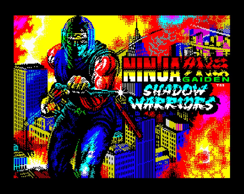
When we started this journey, you may remember that I had my ten loading screens, but at the time they weren’t yet in any particular order. And you’ve probably also noticed that they are now! Behind the curtain, there was a bit of juggling in the mid-field before we got to the order you see here, but there was never any doubt about this being my favourite, just like there wasn’t when I first started noting down the first ideas for what eventually became this list of ten. We’ve already seen some dramatic use of the full Spectrum spectrum, with every colour of its unique rainbow painstakingly selected and crafted into something bigger than the sum of its limited parts. Ninja Gaiden just takes that one step further though. We’re seeing its burning city up close now, and behind the flames that city is a living city, with light realistically reflecting off its varied architecture, which really contrasts with the totally unrealistic but perfectly effective colour palette going bonkers all over it! And check out the war-torn ninja dominating its skyline, also full of colour over all manner of carefully crafted detail, but also even more full of life, with realistically bulging muscles and a mischievous glint behind his masked eyes. It’s just so bombastic and without fear, and it’s everything you could have wanted from a 1988 ninja game thirty years later!


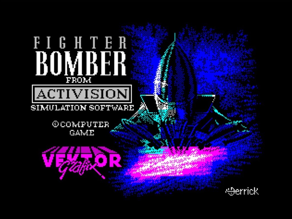

You’ve seen a couple of other old favourites that didn’t quite make the cut dotted about the place already, but before we move on I just wanted to share a bunch more from my original list that would no doubt have made it into a bigger chart rundown. And that’s the only time you’ll ever see me giving the dreadful ZX Spectrum port of Kung-Fu Master any credit for anything! I’m now also thinking I might have done Robocop and Fighter Bomber a disservice, so before I start fiddling…
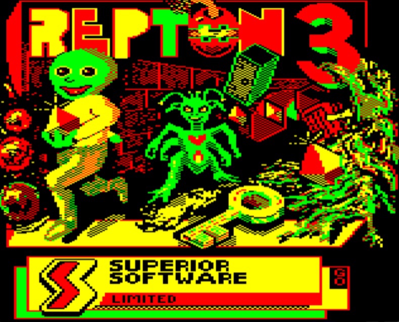
Even without any further fiddling, that actually went on a bit longer than I originally anticipated, so rather than gloss over the handful of Atari ST and Commodore 64 loading screens I had in reserve from my very original list, I think I’m going to evolve those into their own top tens and save them for a rainy day! Realistically there’s never going to be a day that’s rainy enough for a BBC top ten though, so I’m going to give you that one now! Actually, I think I’ve only ever played four games on there, so not a bad hit rate – we’ve got Elite, Chuckie Egg, Beach Head (another great loading screen!) and this, Repton 3… And it’s bonkers! What the game lacks in arcade flair compared to the more frantic Boulder Dash, it more than makes up for with its bizarre main character design and sinister loading screen, which is made even more impactful by its contrasting, minimal colouring. And it’s got the best synthesised speech since Ghostbusters on Commodore 64! Nice game too, and now theres a new vacancy in my list of “other stuff” to cover at some point here, I think Repton 3 on the BBC Micro might just be the one to fill it…

Brilliant art for these games! Thanks for sharing – great list!
LikeLiked by 1 person
Thanks a lot! Glad you enjoyed it.
LikeLiked by 1 person
Very nice but plenty more that are better.
LikeLiked by 1 person
Any in particular? I keep thinking of more that should have been here too.
LikeLiked by 1 person
Fantastic article.
Great Sunday reading.
LikeLike
Thank you! Really appreciate that.
LikeLike